Must Wear Colors for Men in Fall

With the official start of fall, it only makes sense to update your wardrobe. The classics are all there, but what specifically reflects 2018? According to runway presentations and the Pantone Fashion Color Trend Report, that’s strong pops of red, yellow, and purple, plus a few reworked neutrals: As you transition into this vibrant season, consider how to style cloud dancer outfit to capture the essence of these trending colors. Layering is essential, combining those soft neutrals with bold accents for a balanced look. Don’t forget to accessorize with statement pieces that add a personal touch to your ensemble.
This post may have affiliate links, meaning we earn a small commission on purchases through the links (at no extra cost to you). This does not change our opinion but does help support the site. Thank you!


Dark to Bright Red
If you could pull the majority of FW18 menswear collections together and sum up the most salient point, it would be this: Concentrated intensity, pushed to the limits. We’re at a point where both neon shades and metallics feel less ordinary, and thus, a preponderance of reds comes across as tame.
But, “red” solely as a color is divided into multiple camps, with FW18 touching on two. On one hand, according to Pantone’s report, you have “Red Pear,” which could best be described as an offshoot of burgundy, with much of the blue scrubbed out: Deep and dark, with bluish-brown undertones. If red could ever be a neutral shade, this one gets you the closest.
However, you can’t help but associate everything from fires and exotic fruits to lipstick with red, and thus, it’s a color that’s always going to leave an impact. As such, why mute it? As the counterpart to Red Pear, there’s Valiant Poppy, which, true to its name, bursts and burns with all the heat of a hot pepper and the brilliance of a firework.

Yellow in Multiple Shades
Who would’ve thought that yellow would finally have its moment? The shade that rarely looks good on anyone seems to be everywhere: With runway presentations, that’s rave-referencing highlighter shades to low-key preppy mustard tones that finally turn this typically warm color into another neutral hue.
Limelight, Pantone’s version of the former, wouldn’t have been out of place at a Second Summer of Love party nearly 30 years ago, and through that lens, its green-tinted hue is practically celebratory. It draws attention, occupies a bunch of space, and blows everything away. At points, it can seem like the obnoxious person at an event – like that guy at an EDM festival who’s having way too much fun. There can always be too much of a good thing, and Limelight, as such, is best in small, potent doses.
The flipside, this season, is Ceylon Yellow, a shade that, by pure geographic association, brings to mind intense, flavor-heavy curries and mellow teas. Visually, its role falls right in between the two: Yes, there’s an undercurrent of strength, but on the surface, it’s the laidback version you can wear with anything from navy and forest green to dusty rose pink. If you could personify it, Ceylon Yellow’s the individual that stands out but still gets along with everyone.


Reworked Purple
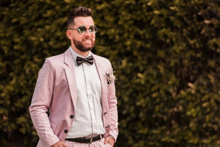
A couple of seasons ago, we heard about how lavender would take over Millennial Pink. For FW18, that eclipse has already occurred, with Crocus Petal juxtaposing the bubblegum hue’s brightness with neutral blue undertones. The result feels about as light as cotton candy but less vapid and ephemeral: It seems fun, but beckons you to learn more.
Royal purple, too, has gotten a similar makeover, this time as Ultra Violet. The similar bright blue-red blend creates the foundation, but as the name implies, there’s something electric about it. In short, it’s purple for guys who’ve graduated from burgundy and want to try out a more statement-making hue.


Olive Green
Camouflage, field jackets, Sherpa-trimmed bombers, and epaulets adorning all forms of outerwear all point to one overarching trend: Menswear’s military moment has yet to pass. While, last year, forest shades were all the rage, olive green – the color dating back decades for military fatigues – continues to stick around, albeit as the more urbane Martini Olive. A departure from the strictly military shade, Martini’s a bit darker, with only faint yellow-brown undertones. The result, then, delivers a reference without hitting you over the head with history.


The Classics
Amongst all the basics, black has been eschewed for brown, while variations on tan and navy round out your key wardrobe shades:
Navy, going by Sargasso Sea this season, blends the sophisticated, if not occasionally boring, staple with a hint of turquoise for a wider, more varied palette.
Tan, in Almond Buff and Tofu forms, exemplifies the perfect transitional suit: A bit of summer with the lightened hue, but something darker and dusty mixed in, to hint the change of the season. Tofu takes a softer approach, while Almond Buff revives camel, a shade nearly ubiquitous back in 2013 and 2014.


Gray, an acceptable replacement for solid, saturated black, gets a few shades lighter and a tad bit softer this season. It’s less charcoal and more like the color of driftwood tumbled in the ocean, before it washes up on the shore.


Chocolate brown continues last year’s nascent affair with the 1970s. What you get is a sepia-filtered version of black that pairs well with the equally nostalgic mustard yellow or burnt orange, yet never looks dated when combined with navy or off-white.